

Think about some of the most iconic logos: Apple, Nike, McDonald’s. What do they all have in common? They nail that first impression and pretty much grab your attention, right? That’s the power of a great logo! It’s not just a random mark; it’s the face of the entire brand. In this piece, we’re diving into some super handy tips from the experts. These aren’t just any tips; they’re practical, actionable insights that can make a difference in how you craft a logo.
So, stick with us whether you’re starting from scratch or thinking about a little brand refresh. We’re about to uncover how to make your logo stand out, resonate with your audience, and embody your brand’s identity.
Understand Your Brand and Audience
Before you even start sketching out designs, there’s a crucial step you can’t skip—getting to know your brand inside and out. What are your brand’s core values? What message are you aiming to scream from the rooftops? A logo must be more than pretty; it must reflect your brand’s values. As the folks at Inkbot Design suggest, aligning your logo with your brand’s core values isn’t just important—it’s essential.
Next up, who are you designing this logo for? Who’s going to see it, and what will make them care? It’s about understanding not just who your audience is but also their preferences, demographics, and even psychographics. ThoughtLab highlights the importance of tailoring your logo to resonate with the people you’re trying to reach. After all, your logo should speak to their needs, desires, and expectations. Get this right, and your logo won’t just be seen; it’ll be remembered.
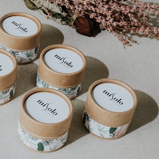
Embrace Simplicity
Ever noticed how some of the most unforgettable logos are surprisingly simple? Take Nike’s swoosh or Apple’s bitten apple—these logos are the epitome of simplicity, and boy, do they stick in your mind! ThoughtLab points out that simplicity isn’t just a style choice; it’s strategic. Simple logos cut through the noise, making them more recognizable and memorable. They’re easy to spot and even recall, exactly what you want in a fast-paced world where everyone is bombarded with visuals. So, when designing, think less about adding more and more about what you can strip away to make that lasting impression. If you’re looking to experiment with designing your own simple yet effective logo, check out this free logo design online tool by Adobe Express, which offers a variety of customization options to help get you started.
Leverage Negative Space
Ever looked at a logo and noticed a hidden image or message tucked away in its design? That’s the magic of negative space—using the background to form an interesting or meaningful part of the overall design. Inkbot Design champions this approach, showing how it adds depth and intrigue to elevate a logo from good to great.
For example, think about the arrow hidden in the FedEx logo. It’s not just clever; it’s visually engaging. By effectively using negative space, you can give your logo a subtle twist that makes people take a second look—and that second look is what makes your logo stick in their minds.
Consider Logo Scalability
One of the make-or-break attributes of a great logo is scalability. This means your logo needs to look as impactful on a tiny app icon as on a massive billboard. Why is this so important? As wix.com explains, your logo will appear in more places than you might expect. From digital screens to physical merchandise, it must maintain its clarity and impact, regardless of size. So, always design with versatility in mind. A scalable logo ensures your brand is represented consistently across all platforms, cementing your visual identity in every context.
Choose the Right Color Scheme
Colors aren’t just about aesthetics; they’re a psychological play that can massively impact brand perception and consumer behavior. Wix.com points out how different colors evoke different feelings and associations. For example, blue can evoke trust and security, while red might spark feelings of excitement or urgency. This means choosing the right color scheme is crucial—it has to align with what your brand stands for. Whether you want to soothe or energize your audience, picking the appropriate colors can help convey your brand’s identity more effectively and connect emotionally with your audience.
Pick a Distinctive Font
Ever thought about how much a font can say about a brand? A unique and readable font catches the eye and plays a critical role in brand recognition. Inkbot Design stresses the importance of choosing a font that’s distinctive and legible in various contexts. Whether on a mobile screen or a billboard, the right font will convey your brand’s character consistently and clearly. Remember, the font you choose becomes a visual cue that tells your audience who you are, almost as much as the logo itself.
Design for Versatility
A versatile logo is like a good all-rounder in sports—effective in every situation. ThoughtLab reminds us that your logo needs to perform well across different mediums and applications.

This means thinking beyond paper and screen; consider how your logo will look on merchandise, in black and white, or even as an app icon. A versatile logo maintains its integrity and essence no matter where it’s used, ensuring your brand is recognized and remembered consistently everywhere.
Test and Iterate
Logo design isn’t a one-and-done deal. It’s about testing, getting feedback, and iterating. ThoughtLab encourages an iterative process where the logo is tested in different environments and uses cases to see how it performs. This might mean tweaking colors, adjusting sizes, or even rethinking elements based on their appearance on different platforms or under various conditions. Continuous refinement based on real-world feedback ensures your logo looks good and works effectively across all touchpoints.
Legal Considerations
Before you finalize that killer logo, don’t forget the legal side. ThoughtLab highlights the importance of conducting thorough trademark searches to ensure your logo doesn’t step on any toes. Once clear, taking steps to protect your logo through trademarks or copyrights can save you many headaches. It’s about ensuring your hard work is safeguarded, and your logo remains uniquely yours.
Conclusion
Crafting a memorable logo is more than just drawing a cool design. It combines creativity, strategic thinking, and a deep understanding of your brand and audience. From choosing the right colors and fonts to ensuring versatility and legality, every element plays a crucial role in making your logo emblematic of your brand. So take these tips, let your creativity flow, and design a logo that looks fantastic and resonates deeply with your target audience. Remember, a great logo is the first step in telling your brand’s story—make it count!